
Dropdown In Flutter

Dropdown

We use the Dropdown Button to display any Dropdown List item as we can change its style according to the requirement. We can customize the dropDown widget with given properties like background color, hint, items, and many more. Let’s see some of the properties of the dropdown button for example.

1. Items

We will use this property to define items displayed in the dropdown list as text values. We can define the items directly or we can define using a list.

Firstly we can see how to define items directly. We are declaring one global variable and set value 1 so in the dropDown value, we can not see an empty value. and with the use of DropdownMenuItem() we can see the value of that particular item. Let's see the example of how to use items directly:-

The second way is to use items property as a list of values and set that values in the Text widget.

2. Value

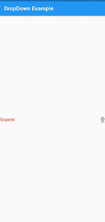
We will use value property to set the selected item from the dropdown button. When the user selects the option from the dropdown on the onChanged() method it will be invoked with the value of the dropdownMenuItem. We can get the value of the selected item and set that value in the setState() method so we can see the updated value of dropDown.

We have already seen the example in which we have declared value and set the value after that onChanged() updated the selected value in dropDownButton.

3. hint

As the name said hint in the dropdown button will display the down indicator with empty value or text.to set the default text you can use the hint property. As we have set Text "Please select your state".

4. elevation

We will use elevation property to elevate the dropdown list. The value can be from 1 to 9.

5. style

We want to style the items of dropDown then we can use the style in DropdownMenuItem() and if you want to style the hint then use this property in hint property.

6. icon

You can set the dropDown icon as per requirement. For that need to use the icon property and we can set the Icon Widget and icon which we want to show.

7. iconDisabledColor

This property is used to set icon color when the dropdown button is disabled. To show this your button value should be null to see this output you need to null the onChange method.

8. iconEnabledColor

This property is used to set the icon color of the dropdown button. This color will apply only if the button is enabled meaning not null value.

9. iconSize

IconSize property is used to define the size of the dropdown button icon.

10. isExpanded

This property is used to expand the dropdown button to full width. you need to set up the value to true will expand and false will keep the button width to default. If you want some space from the right and left so you can wrap the DropdownButton into the padding or you can use margin as per your comfort.

11. dropdownColor 

DropdownColor property is used to set the color of the dropdown list. Here in the example, I have set the amber color and also change the color of values to black.


Comments

Popular posts from this blog

Flutter BottomNavigationBar

BottomNavigationBar A material widget that's displayed at the bottom of an application. Which shows around three to five items and it includes labels and icons. BottomNavigationBar allows you to select one item at a time and quickly navigate to a given page. Properties of the BottomNavigationBar : items: It defines the list of BottomNavigationBar Items to display the bottom navigation bar. currentIndex: It determines the current active bottom navigation bar item on the screen. onTap: It is called when we tapped one of the items on the screen. iconSize: It is used to specify the size of all bottom navigation item icons. fixedColor: It is used to set the color of the selected item. If we have not set a color to the icon or title, it will be shown. type: It determines the layout and behavior of a bottom navigation bar. It behaves in two different ways that are:  1. fixed: Default it is fixed and If it is null, it will use fixed. 2. shifting: It will use shifting where w

MaterialApp and Scaffold in Flutter with Example

What is MaterialApp Material design is for Google Android material design which is used to create UI for Android.MaterialApp is a predefined class in a flutter that extends the Material Design class. It is likely the main or core component of flutter. We can access all the other components and widgets provided by Flutter SDK. It is a class that creates an instance of [WidgetsApp] . Text widget, AppBar widget, Scaffold widget, ListView widget, StatelessWidget, StatefulWidget, IconButton widget, TextField widget, and many more widgets that are accessed using MaterialApp class.  For iOS, there is the Cupertino widgets class which I'll describe or discuss or explain in another article. What is Scaffold In Flutter Scaffold is a very useful and highly flexible class. Scaffold implements the basic material design layout structure. A Scaffold Widget provides a framework that implements the flutter app's basic material design visual layout structure.  The developer can implement a wide

Flutter TextField with Examples

Introduction to TextField TextField in Flutter is the most commonly used text input widget that allows users to collect inputs from the keyboard into an app. We can use the TextField widget in building forms, sending messages, creating search experiences, and many more. By default, Flutter decorated the TextField with an underline. We can also add several attributes with TextField, such as label, icon, inline hint text, and error text using an InputDecoration as the decoration. If we want to remove the decoration properties entirely, it is required to set the decoration to null. 1. decoration It is used to show the decoration around TextField.The most common attributes in decoration are as follows: border : It is used to create a default rounded rectangle border around TextField. labelText : It shows the label text on the selection of TextField. hintText : It shows the hint text inside TextField when there is no text entered.   TextField(               decoration: InputDecoration(