Introduction to TextField
TextField in Flutter is the most commonly used text input widget that allows users to collect inputs from the keyboard into an app. We can use the TextField widget in building forms, sending messages, creating search experiences, and many more.
By default, Flutter decorated the TextField with an underline. We can also add several attributes with TextField, such as label, icon, inline hint text, and error text using an InputDecoration as the decoration. If we want to remove the decoration properties entirely, it is required to set the decoration to null.
1. decoration
It is used to show the decoration around TextField.The most common attributes in decoration are as follows:
border: It is used to create a default rounded rectangle border around TextField.
labelText: It shows the label text on the selection of TextField.
hintText: It shows the hint text inside TextField when there is no text entered.
TextField(
decoration: InputDecoration(
border: OutlineInputBorder(),
labelText: 'Username',
hintText: 'Enter Username',
),
)
2. textInputAction
It is used to specify the TextInputAction type of the keyboard. Flutter gives the different types of TextInputAction type like we are seeing in example and there are many more TextInputAction is there like Search we will use this at the time of Searching from the list, Send we can use this Type when we are creating Chat application.
So let's see thr example of some textInputAction.
Done : We can use this TextInputAction when we complete our writing for that particluer TextField.
TextField(
decoration: InputDecoration(
border: OutlineInputBorder(),
labelText: 'Username',
hintText: 'Enter Username',
),
textInputAction: TextInputAction.done,
)
Next : We can use this TextInputAction when we want to go to the next TextField.
TextField(
decoration: InputDecoration(
border: OutlineInputBorder(),
labelText: 'Username',
hintText: 'Enter Username',
),
textInputAction: TextInputAction.next,
)
NewLine : We can use this TextInputAction when we have multiline Input like Address it is same as enter ActionType.
TextField(
decoration: InputDecoration(
border: OutlineInputBorder(),
labelText: 'Username',
hintText: 'Enter Username',
),
textInputAction: TextInputAction.newline,
)
3. textAlign
We have already learned about the textAlign property in previous Blogs. In Flutter, textAlign gives multiple alignments like start, end, center, justify, left, and right textAlign. We are seeing the Example of TextAlign.justify How it will show in the UI.
TextField(
decoration: InputDecoration(
border: OutlineInputBorder(),
labelText: 'Username',
hintText: 'Enter Username',
),
textAlign: TextAlign.justify,
)
4. textDirection
textDirection will give you the option to set the Direction as per our requirement. If we want to display text Left to Right then we can use the LTR direction. and If we want to display text Right to Left then we can use RTL direction. They Provide the Two Direction which we are seeing in Example :
Example of TextDirection LTR :
TextField(
decoration: InputDecoration(
border: OutlineInputBorder(),
labelText: 'Username',
hintText: 'Enter Username',
),
textAlign: TextAlign.justify,
textDirection: TextDirection.ltr,
)
Example of TextDirection RTL:
TextField(
decoration: InputDecoration(
border: OutlineInputBorder(),
labelText: 'Username',
hintText: 'Enter Username',
),
textAlign: TextAlign.justify,
textDirection: TextDirection.rtl,
)
5. maxLines
As you can already guess, using this property by its name. with the use of this property, we can predefine the maximum lines for the user to write the text in the TextField.
TextField(
decoration: InputDecoration(
border: OutlineInputBorder(),
labelText: 'Address',
hintText: 'Enter Address',
),
textInputAction: TextInputAction.newline,
maxLines: 5,
)
6. minLines
minLines Property with the use of this we can define the minimum lines user can write in the TextField. But in this we need to define also the maxLines otherwise it will through the error.
TextField(
decoration: InputDecoration(
border: OutlineInputBorder(),
labelText: 'Address',
hintText: 'Enter Address',
),
textInputAction: TextInputAction.newline,
textAlign: TextAlign.justify,
textDirection: TextDirection.ltr,
minLines: 5,
maxLines: 10,
)
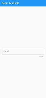
7. maxLength
maxLength Property with the use of this we can Define the Maximum Length of that TextField So User can not input more than that Lenght and in a flutter, it gives the Count of the Character which we are adding in the TextField which also looks Good in UI. Let's see the Example
TextField(
decoration: InputDecoration(
border: OutlineInputBorder(),
labelText: 'Email',
hintText: 'Enter Email',
),
textInputAction: TextInputAction.done,
maxLength: 15,
)
8. readOnly
We can control whether a TextField is read-only or not by setting its readOnly property to true or false. If you need to give them access to the user for ReadOnly from TextField, not for input access then you can give True value otherwise you can define False value.
Example of readOnly True :
decoration: InputDecoration(
border: OutlineInputBorder(),
labelText: 'Email',
hintText: 'Enter Email',
),
textInputAction: TextInputAction.done,
maxLength: 15,
readOnly: true,
)
Example of readOnly False :
decoration: InputDecoration(
border: OutlineInputBorder(),
labelText: 'Email',
hintText: 'Enter Email',
),
textInputAction: TextInputAction.done,
maxLength: 15,
readOnly: false,
)
9. showCursor
We can control whether a TextField shows the cursor using showCursor by setting its showCursor property to true or false.
Example of showCursor True :
TextField(
decoration: InputDecoration(
border: OutlineInputBorder(),
labelText: 'Email',
hintText: 'Enter Email',
),
textInputAction: TextInputAction.newline,
textAlign: TextAlign.justify,
textDirection: TextDirection.ltr,
showCursor: true,
)
Example of showCursor False :
TextField(
decoration: InputDecoration(
border: OutlineInputBorder(),
labelText: 'Email',
hintText: 'Enter Email',
),
textInputAction: TextInputAction.newline,
textAlign: TextAlign.justify,
textDirection: TextDirection.ltr,
showCursor: false,
)
10. autocorrect
We can control whether a TextField shows the autocorrect by setting its autocorrect property to true or false.
Example of autocorrect True :
TextField(
decoration: InputDecoration(
border: OutlineInputBorder(),
labelText: 'Email',
hintText: 'Enter Email',
),
textInputAction: TextInputAction.done,
textAlign: TextAlign.justify,
textDirection: TextDirection.ltr,
autocorrect: true,
)
Example of autocorrect False :
TextField(
decoration: InputDecoration(
border: OutlineInputBorder(),
labelText: 'Email',
hintText: 'Enter Email',
),
textInputAction: TextInputAction.done,
textAlign: TextAlign.justify,
textDirection: TextDirection.ltr,
autocorrect: false,
)
11. autofocus
We can control whether a TextField shows the autofocus by setting its autofocus property to true or false. If you define the value of autofocus True then it will focus on textField without tapping on that. If you define autofocus False's value, you need to manually tap to focus on textField.
Example of autofocus True :
TextField(
decoration: InputDecoration(
border: OutlineInputBorder(),
labelText: 'Email',
hintText: 'Enter Email',
),
textInputAction: TextInputAction.done,
textAlign: TextAlign.justify,
textDirection: TextDirection.ltr,
autofocus: true
)
Example of autofocus False :
TextField(
decoration: InputDecoration(
border: OutlineInputBorder(),
labelText: 'Email',
hintText: 'Enter Email',
),
textInputAction: TextInputAction.done,
textAlign: TextAlign.justify,
textDirection: TextDirection.ltr,
autofocus: false
)
12. textCapitalization
We can Configure how the user can input from the keyboard will select an uppercase or lowercase from the keyboard.
words: It means it will write every word's first latter into capital latter.
TextField(
decoration: InputDecoration(
border: OutlineInputBorder(),
labelText: 'Email',
hintText: 'Enter Email',
),
textInputAction: TextInputAction.done,
textAlign: TextAlign.justify,
textDirection: TextDirection.ltr,
textCapitalization: TextCapitalization.words,
)
sentences: It means it will write every sentence's first latter into capital latter.
TextField(
decoration: InputDecoration(
border: OutlineInputBorder(),
labelText: 'Email',
hintText: 'Enter Email',
),
textInputAction: TextInputAction.done,
textAlign: TextAlign.justify,
textDirection: TextDirection.ltr,
textCapitalization: TextCapitalization. sentences,
)
characters: It means it will write the every character in capital latter.
TextField(
decoration: InputDecoration(
border: OutlineInputBorder(),
labelText: 'Email',
hintText: 'Enter Email',
),
textInputAction: TextInputAction.done,
textAlign: TextAlign.justify,
textDirection: TextDirection.ltr,
textCapitalization: TextCapitalization. characters,
)
13. keyboardType
A TextField allows you to customize the type of keyboard that shows up when the TextField is into focus. We change the keyboardType property for this.
Number : It will allow user to input only numbers.
TextField(
decoration: InputDecoration(
border: OutlineInputBorder(),
labelText: 'Number',
hintText: 'Enter Number',
),
textInputAction: TextInputAction.done,
textAlign: TextAlign.justify,
textDirection: TextDirection.ltr,
keyboardType: TextInputType.number,
)
emailAddress : It will allow user to input only emailAddress regarding inputs.
TextField(
decoration: InputDecoration(
border: OutlineInputBorder(),
labelText: 'Email',
hintText: 'Enter Email',
),
textInputAction: TextInputAction.done,
textAlign: TextAlign.justify,
textDirection: TextDirection.ltr,
keyboardType: TextInputType.emailAddress,
)
name : It will allow user to input only characters.
TextField(
decoration: InputDecoration(
border: OutlineInputBorder(),
labelText: 'Username',
hintText: 'Enter Username',
),
textInputAction: TextInputAction.done,
textAlign: TextAlign.justify,
textDirection: TextDirection.ltr,
keyboardType: TextInputType.name,
)
14. obscureText
In the TextField widget where users can input passwords and do not need to know others then in the scenario, we use the symbol to hide that text.
TextField(
decoration: InputDecoration(
border: OutlineInputBorder(),
labelText: 'Email',
hintText: 'Enter Email',
),
textInputAction: TextInputAction.done,
textAlign: TextAlign.justify,
textDirection: TextDirection.ltr,
obscureText: true,
)
15. obscuringCharacter
obscuringCharacter in this property we can set the Symbol for our obscureText what type of symbol we can show on the behalf of text. So, we can use the astrict sign on behalf of the default given rounded symbol.
TextField(
decoration: InputDecoration(
border: OutlineInputBorder(),
labelText: 'Email',
hintText: 'Enter Email',
),
textInputAction: TextInputAction.done,
textAlign: TextAlign.justify,
textDirection: TextDirection.ltr,
obscureText: true,
obscuringCharacter: "*",
)
16. style
We can style the TextField with use of this property Flutter give us multiple attribute to style the TextField like Color, foreground color, background color, fonweight, fontfamily, fontsize and many more from this we ca seee the some of the attribute in our Example:
TextField(
decoration: InputDecoration(
border: OutlineInputBorder(),
labelText: 'Username',
hintText: 'Enter Username',
),
textInputAction: TextInputAction.done,
textAlign: TextAlign.justify,
textDirection: TextDirection.ltr,
style: TextStyle(
color: Colors.redAccent,
fontSize: 20,
decoration: TextDecoration.overline,
),
)
17. controller
If you have an editable text widget then you need to store the value of that text somewhere. The simplest way is by setting a TextEditingController as the controller of a TextField. The value of the textField is updated with the use of this controller.
18. focusNode
When a textField is selected and accepting input from a user at that time it is focused. If we want to focus TextField we are tapping on the textField but you do not need to do tapping without tapping you need to do focus in another TextField then you can use the FocusNode().
[Note: We will be discussing the example of the controller and focusNode in detail in the immediate next Blog.]


Comments
Post a Comment